Tentera - Indonesian Coffee Hub
My Role
UX Design
Product Design
Team
Individual
Timeline
2 weeks, 2023
Overview
Tentera is a brand rooted in the founder's deep connection to Indonesia and their love for coffee and surfing. This brand aims to provide high-quality coffee from farms in Indonesia, and they sell their product mainly on their website.
Problem
Not Addressing The Product:
Non-product-related images take up a significant amount of space on all pages, causing confusion for users and disrupting purchase actions.
Disjointed User Experience:
The website suffers from an abundance of unnecessary pages, leading to a cluttered user experience and making it difficult for visitors to find relevant content.
Difficult to Browse:
The content design on this website lacks hierarchy. Overwhelming use of font types and a center-aligned layout create challenges for users when browsing the web page.
Goals
- • Prioritize Product-Centric Design to Increase Sales.
- • Improve Website Structure for a Smooth User Experience.
- • Create a More User-Centric Website Focused on Users' Needs.
- • Optimize Content Design for easy browsing.
Research
Competitive Analysis
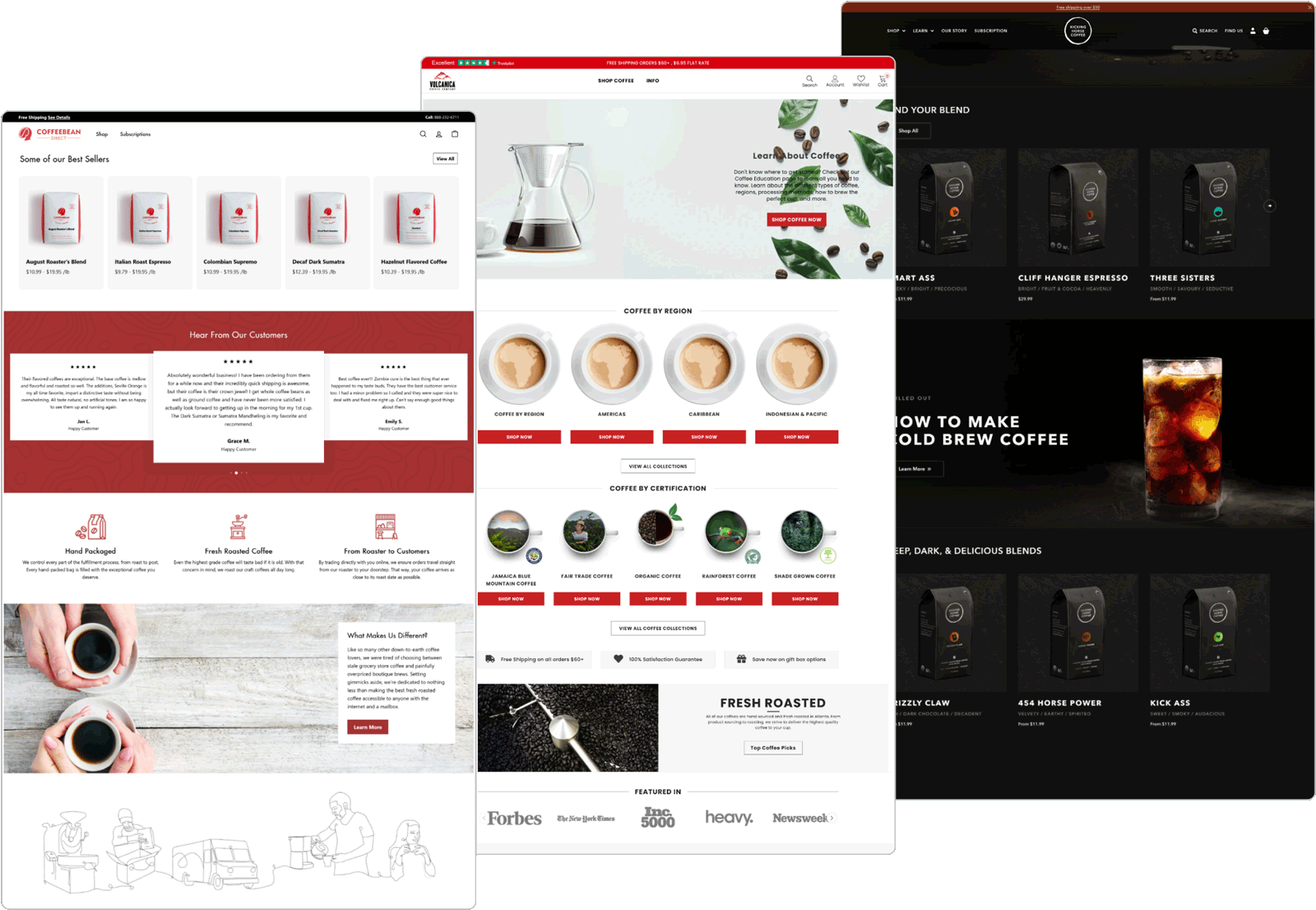
To gain inspiration and identify best practices for Tentera’s website redesign, I conducted a competitor analysis. I began by examining the websites of several other American coffee bean companies selling Indonesian coffee, including Coffee Bean Direct, Volcanica Coffee, and Kicking Horse Coffee.
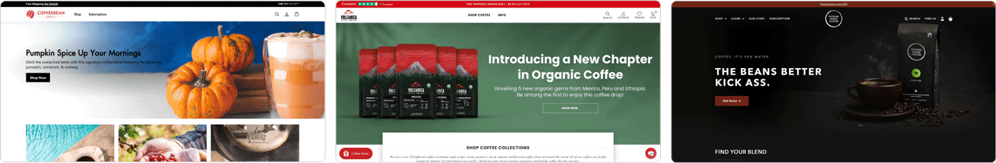
The common design pattern I observed was that all these companies include three main sections on their website homepages: a large hero section, product lists, and the company's mission. They also use a simple header and consistent theme colors. Product information and images are prominently featured on the web page. They employ concise content combined with large images to explain and guide customers.
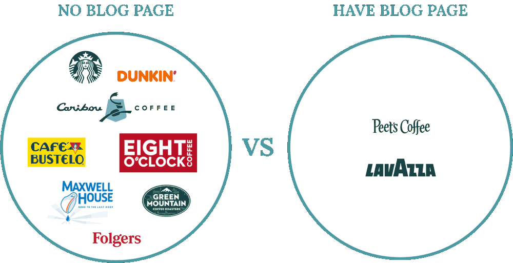
Considering the main function of Tentera's website is to drive sales, the existence of a Blog page becomes debatable. To find out whether the blog page benefits the company and to gain a better understanding of how coffee companies structure their webpages to facilitate user engagement and drive sales, I analyzed the websites of the ten largest coffee brands in the United States. All of the websites include a great number of banners to display their products and call for action. Large images and concise content convey the essential information to the customers. Most importantly, only 2 out of the 10 websites include a blog on their homepage.
Ideation
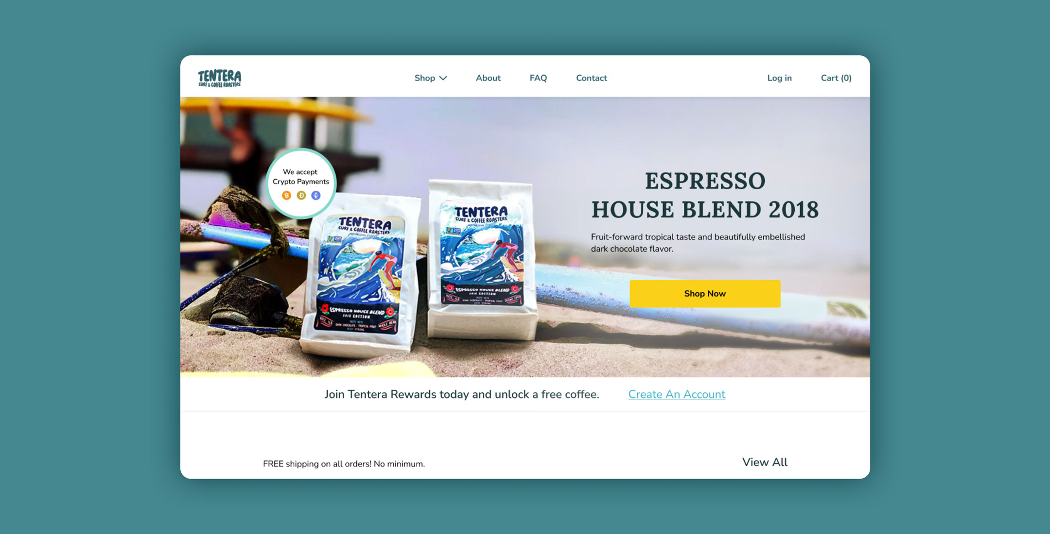
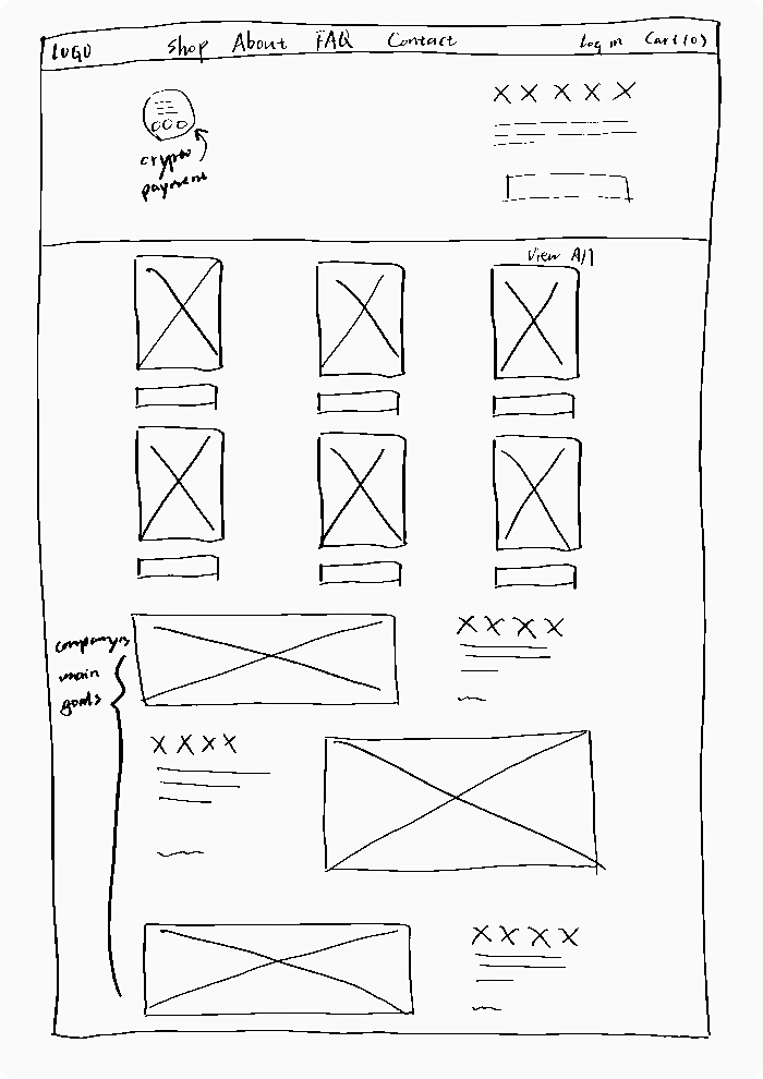
1. Homepage: A Three-Section Redesign
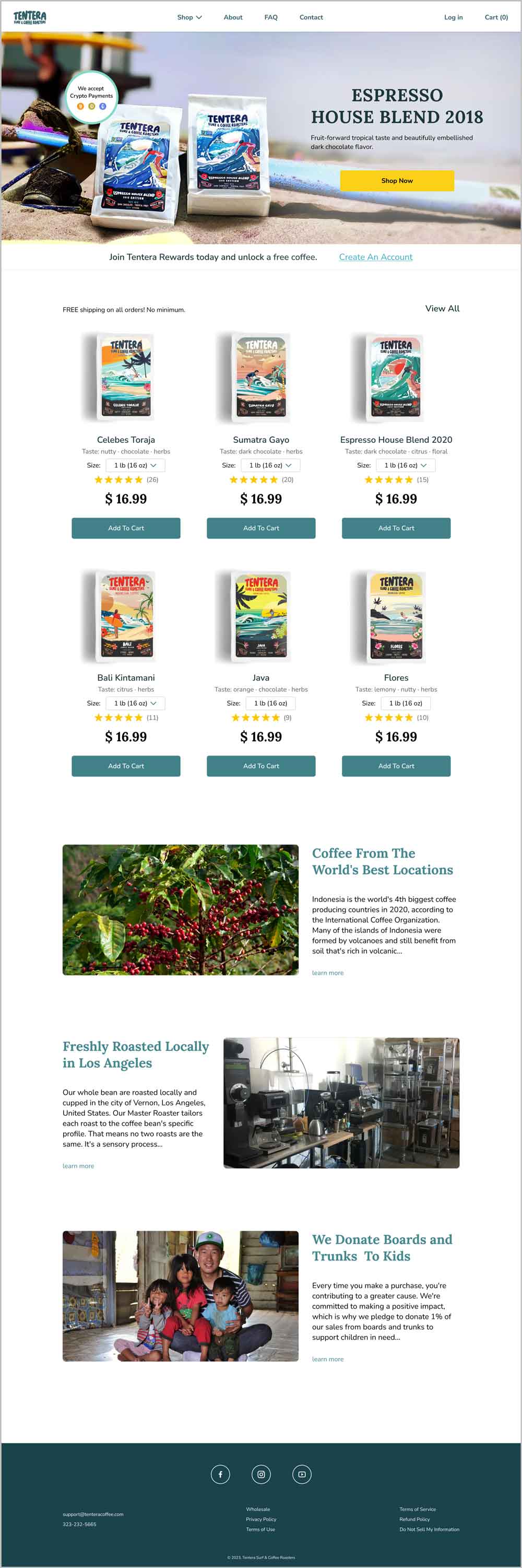
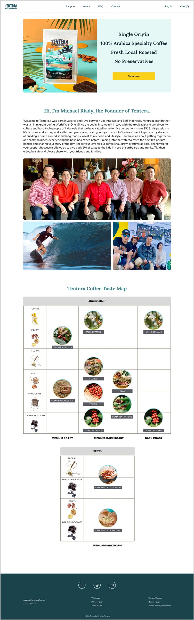
Based on competitive research, I redesigned Tentera's website homepage into three sections. The primary part of the homepage features a large hero section with popular product information, large product images, important updates, and an action button to draw customers' attention and drive sales. Following that is a product list which provides more purchase options for customers. I added a size option to convenience the purchase process. The last section is the company's mission, which highlights the company's goals and how it differs from other companies.
Considering most of the competitors use a simple header on their website to navigate users and don't include a Blog page, I combined the About Us and Indonesian Coffee pages into the About page and removed the Blog page. I also removed the Brew Guides page since all the links are broken.
2. Restructure Pages For Easy Navigation
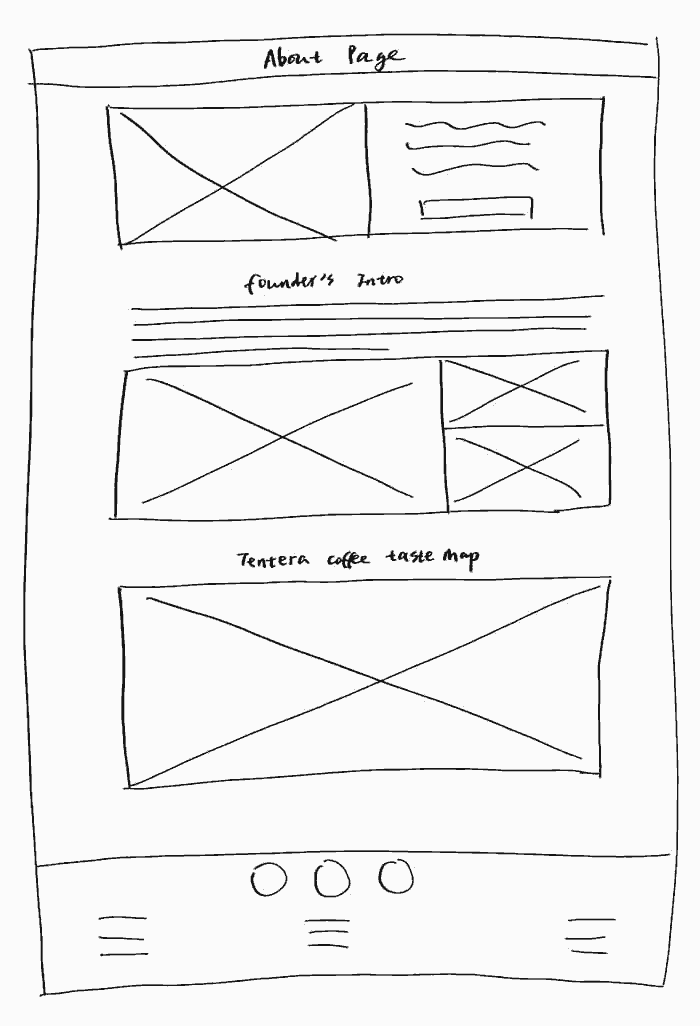
The original website had related information spread out on different pages, which distracted customers from taking action. The redesign extracted essential information from both the About Us and Indonesian Coffee pages to provide a simple introduction about the product and the founder. A product banner was displayed at the top of the page, featuring a button that highlights key marketing points and encourages action.
3. Organizing Content
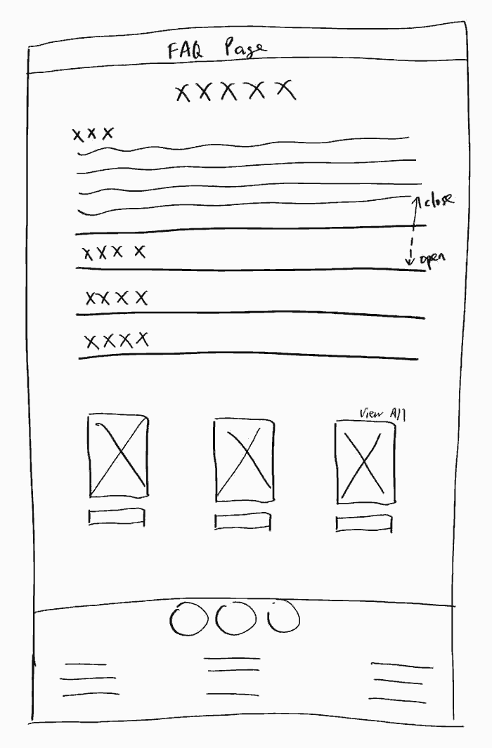
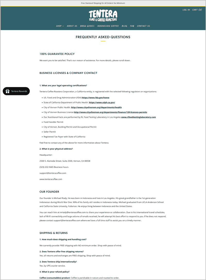
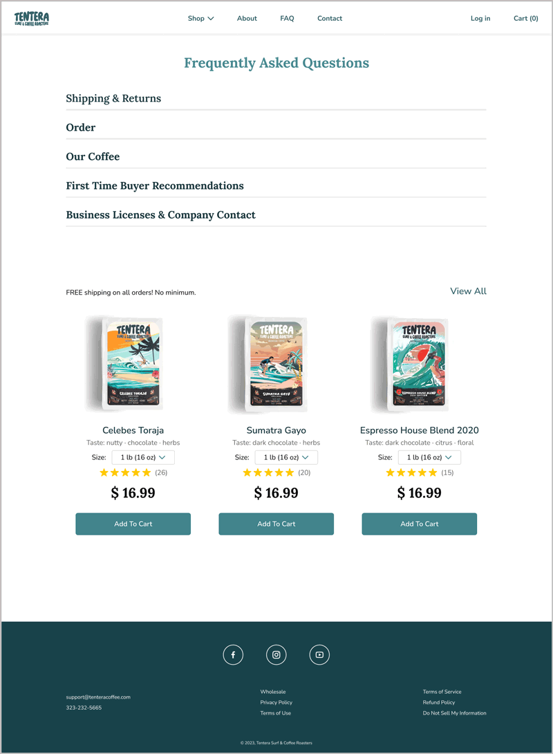
The FAQ page included a lot of important information. To avoid overwhelming the user with very long text, I placed different content into an accordion section that shows each section one at a time. By doing this, customers can quickly find the information they need without scrolling through the page.
To establish a clear content hierarchy, I also changed the page layout and content layout to improve readability and the overall browsing experience. A product section was presented to conveniently serve users and encourage sales.
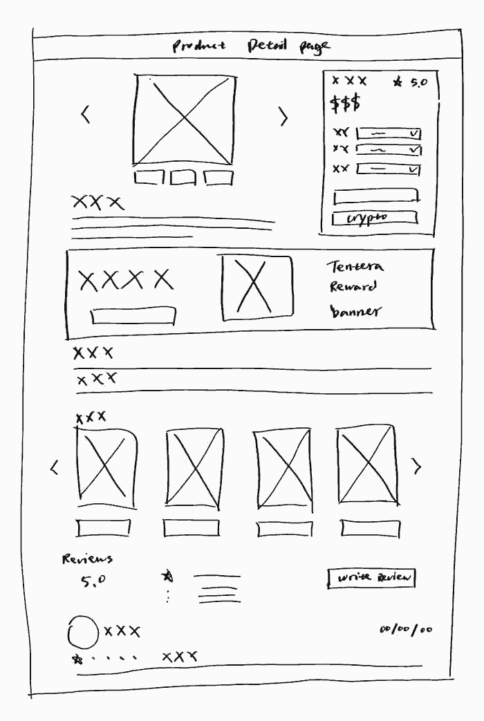
4. Hierarchy and Style
To establish a clear content hierarchy and create a consistent style across different pages, I added clear labels to different sections of the product detail page to enhance readability and improve the overall browsing experience. I also adjusted colors to maintain a consistent style.
A banner featuring a product image and a call-to-action button was created based on the Tentera Rewards section to highlight this service and call for action.
Final Design
BEFORE - Homepage
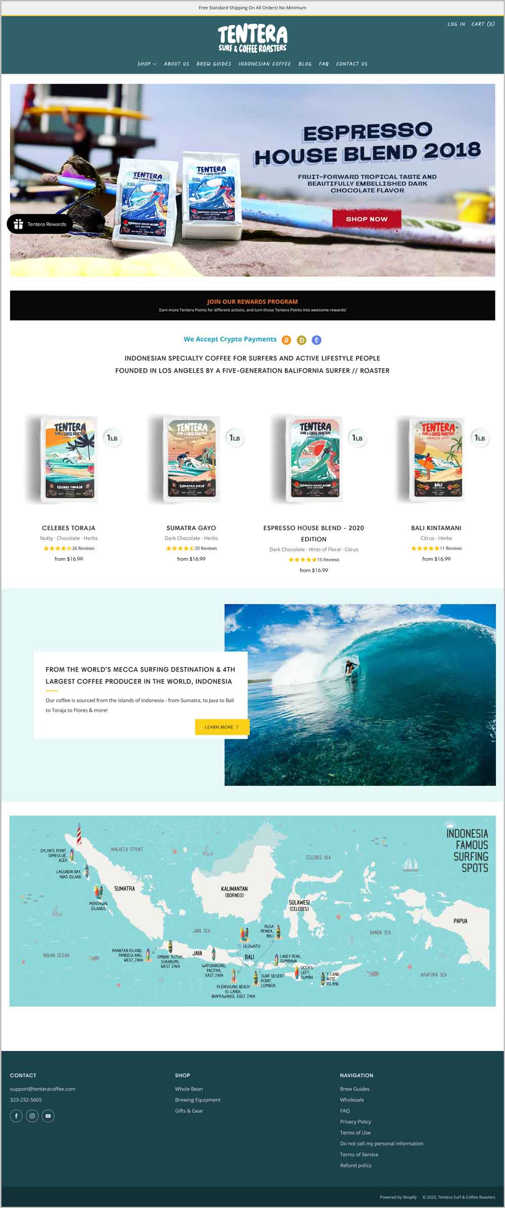
AFTER - Homepage
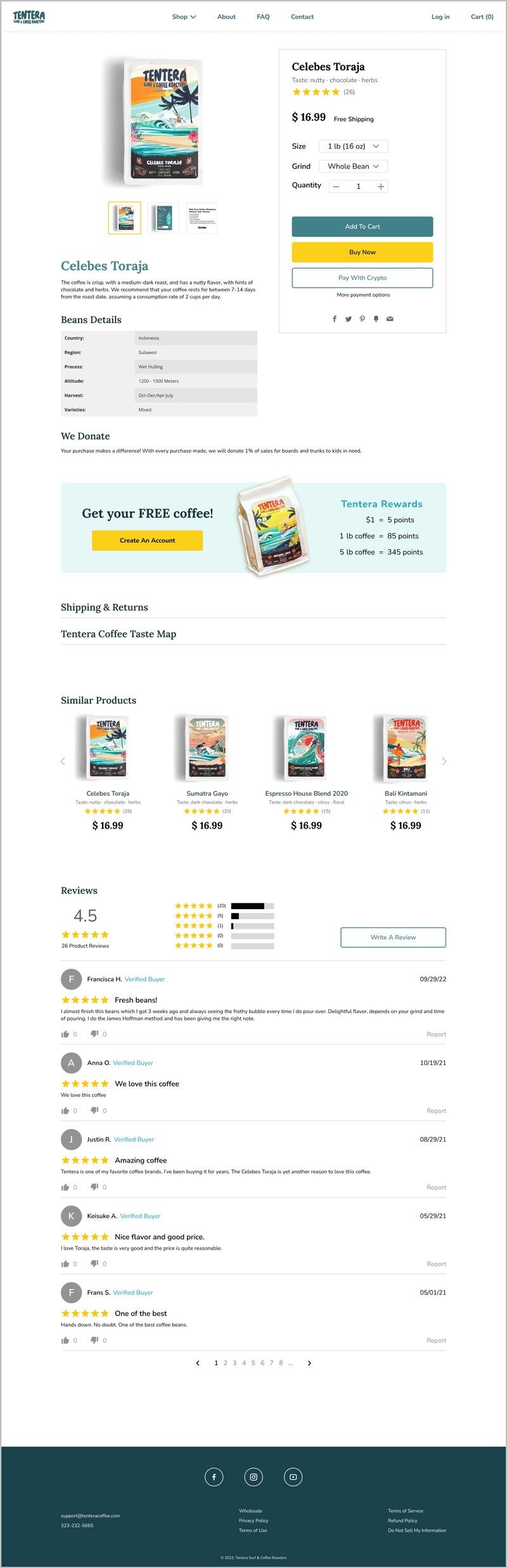
BEFORE - Product Detail Page
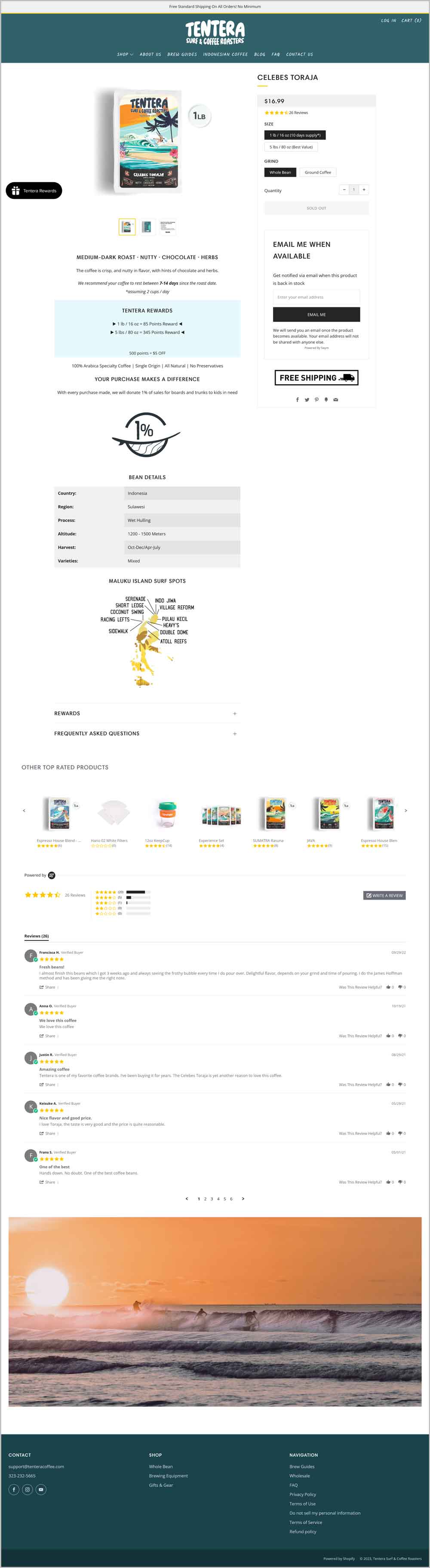
AFTER - Product Detail Page
BEFORE - Mission-related Pages
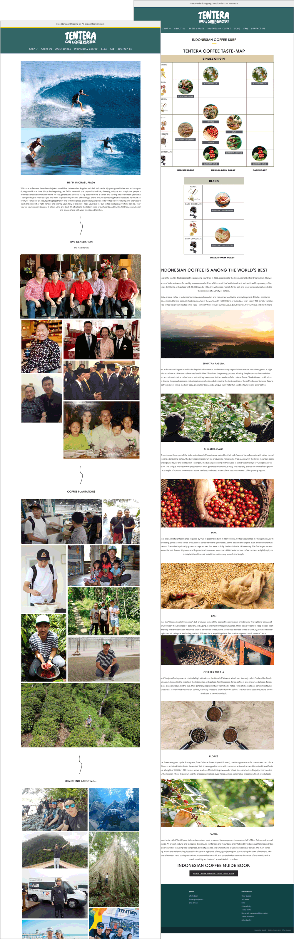
AFTER - About Page
BEFORE - FAQ Page
AFTER - FAQ Page
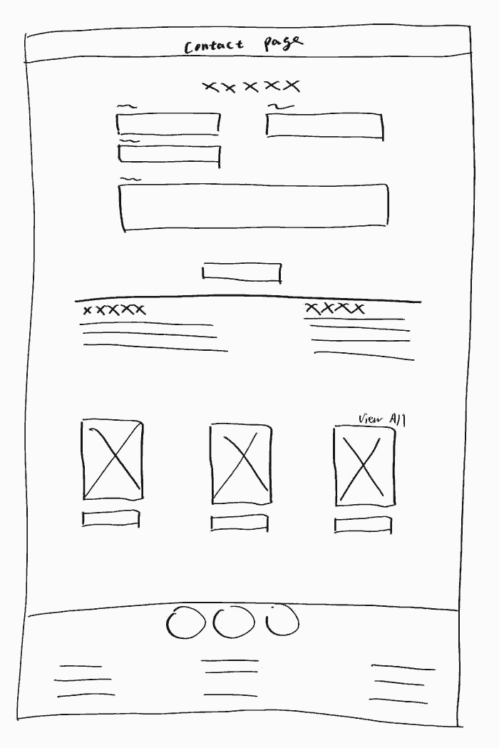
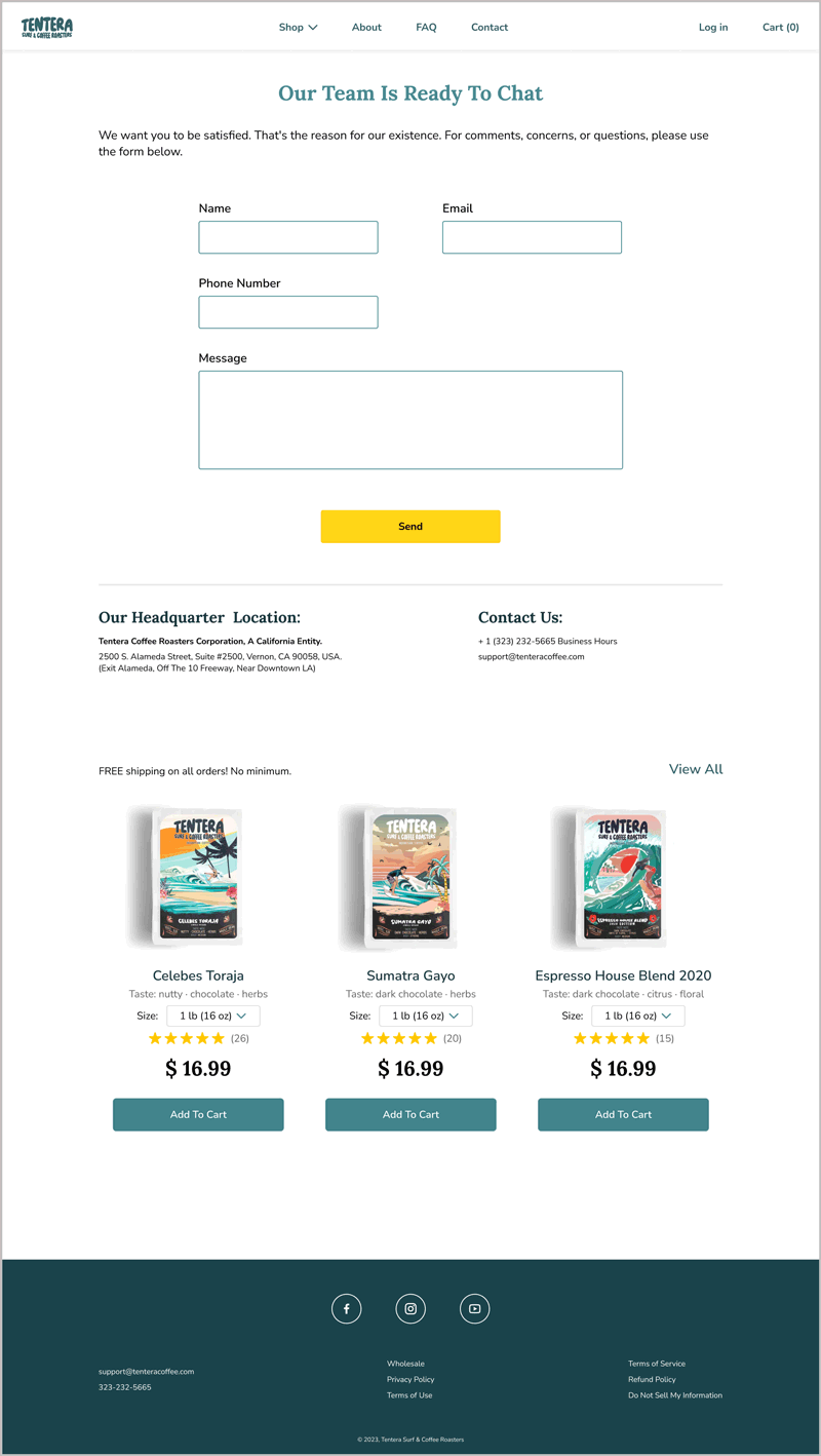
BEFORE - Contact Page
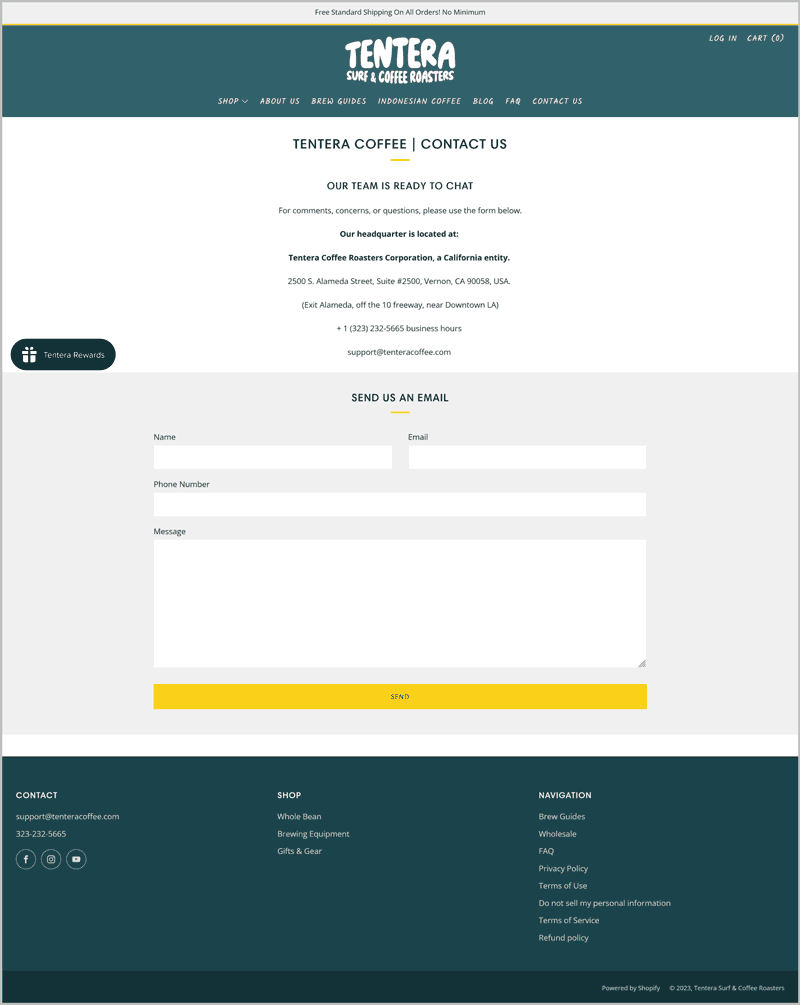
AFTER - Contact Page
Prototype
Click 👉 HERE 👈 for the interactive prototype!
Reflection
This individual website redesign is an invaluable experience for me. It offers a real-world perspective on the challenges and successes encountered during the process of revamping a digital platform. By delving into specific details, one can uncover the strategies used to enhance user experience, optimize content organization, and maintain design consistency. Such case studies often provide valuable insights into how small adjustments, like adding clear labels or incorporating dynamic banners, can significantly impact a website's effectiveness. They serve as practical lessons, guiding us toward more informed decisions when it comes to creating user-friendly and visually appealing online spaces.
Note: I do not work for, nor am I affiliated with Tentera. This UX study was done as a learning experience for me to explore products I love and how to make it even better.